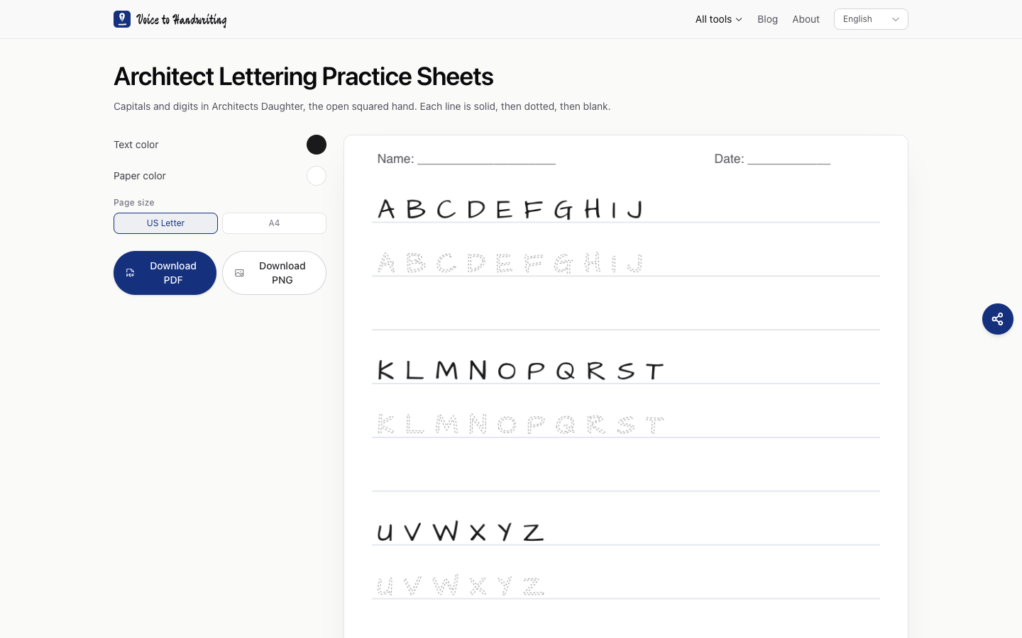
Practice squared handwriting for fifteen minutes a day
I wanted capitals that sit in a box, the way notes on a drawing look. The architect lettering practice sheets use Architects Daughter, the face Kimberly Geswein published under the SIL Open Font License. Google Fonts describes it as inspired by the writing of the daughter of an architect: squared, and still a handwriting. It is that open font. Paid fonts sold under a similar name are different files.
Look at your capitals first
| What you see | What it means | Fifteen minutes |
|---|---|---|
| Letters lean a different way in each word | The slant is unset | Trace one solid row of A through J and keep the same lean |
| Gaps between letters jump | Spacing | Trace the dotted row and leave the gap you see on the model |
| The bottoms bounce | The baseline | Stay on the printed line. The blank row comes after two clean dotted rows |
| You want a machine stencil | A different hand | This sheet keeps the handwritten square |
Single-stroke drafting templates and school handwriting programs draw their own letters. This page prints Architects Daughter: three rows of capitals and the digits 0–9. Each line is solid, then dotted, then blank.
One week
| Day | On the sheet |
|---|---|
| 1 | A through J. Finger on the solid row five times, then once with a pencil |
| 2 | The dotted row of the same letters |
| 3 | K through T, the same two steps |
| 4 | U through Z, then the digits |
| 5 | Blank row, model covered, one line you actually write: your name, a street, a room number |
| 6 | That same line, slower, on lined paper |
| 7 | Three copies side by side. Same height, same slant. Keep the two that match |
Four to six weeks of this makes the capitals consistent enough to read. Matching a drafter's template is a longer road, and this font stays a handwriting. Fifteen minutes is the dose. A Sunday pass through the whole alphabet teaches rush, and the square collapses.
Your own capitals will still look like you. The font is the model for the month.